Sferiq Identity Rebrand Photography
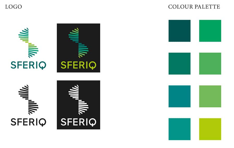
This project was part of the branding for the identity of Sferiq Investment.
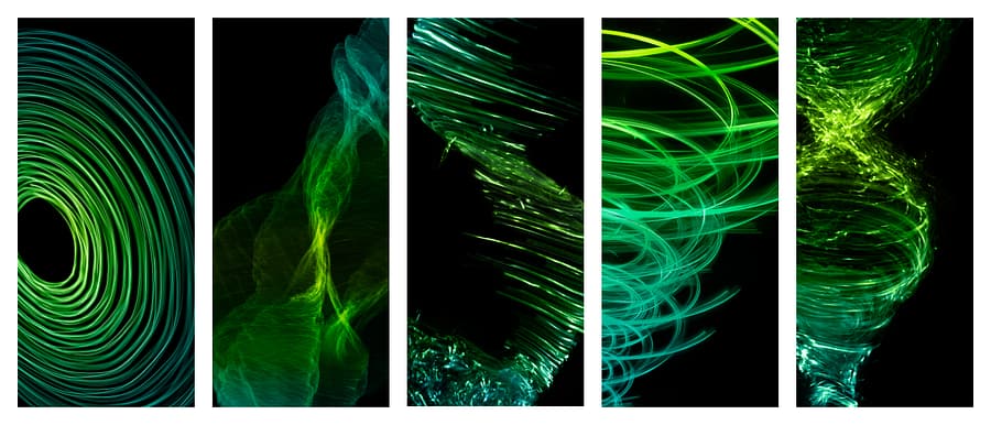
We were given the branding logo and colours and the project was to create a range of abstract photographic images that reinforced the central concepts of equilibrium, and ‘balance is acheived through constant motion’.
A number of subjects were photographed in the studio using materials of the colours in the brief, and this was accentuated by adding appropriate colour overlays. Images were cut out and superimposed to accentuate and exaggerate the movement of the image.
Sferiq: http://sferiq.com/en/#/home_en
Art Direction by Interbrand: http://interbrand.com/
Photography by Ranald Mackechnie: http://www.ranaldmac.com
Post Production and Retouching by John Deaville: http://www.photofixer.co.uk
All images copyrighted to credited photographers. Please do not reproduce without written consent, thank you.
Please click below to see a scrollable/swipable collection of images from this project.
Tags: Brand Identity, Colour, Creative Retouching, Illustration, John Deaville, London Creative Retoucher
Categorised in: advertising retouching, creative retouching


